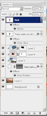
Follow the tutorial to make a postcard that shows your visit to New York City!
It will look something like this:
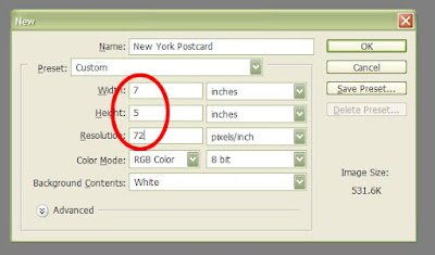
W= 7 inches, H= 5 inches @ 72 p/i (Hit Enter/Return Key)
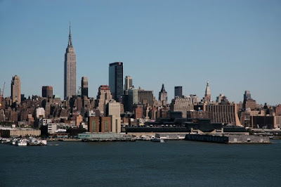
Step #2: Download the following New York City Skyline Photo: Right Click to Copy
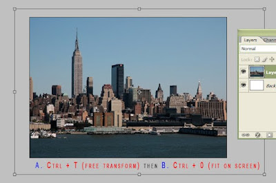
Step #3: Fit your photo on the screen and move to a desired location on your canvas. You may need to scale up or down depending on the look and size. (See screen shot). Don't forget to hit "return" to apply the transformation.
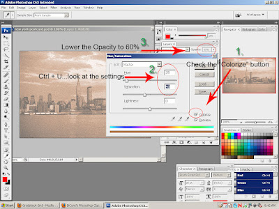
Step #4: Desaturate/Lower Opacity/Colorize (See Screen Shot)...
First, desaturate your photo (Shift + Ctrl + U). Then, Ctrl + U, to open the Hue/Saturation dialogue box. See the screen shot and follow the order of the green numbered steps.
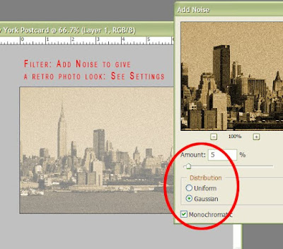
Step #5: Add Noise (to give it that "old" look...).
Go up to Filter>Noise>Add Noise (See screen shot for settings)
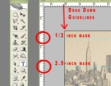
Step #6: Drag Down Guidelines
Ctrl + R to bring up the rulers. Go into the horizontal ruler with your cursor and click and drag to the specified positions as shown in the screen shot.
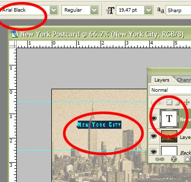
Step #7: Creating a Type Layer
a. Create a Type Layer using your Type Tool. Click between the guidelines. Double click the "T" thumbnail to highlight your word. Go up to your Options Bar and choose a Arial Black--about 20 pt. Type out "New York City". The font color is not important.
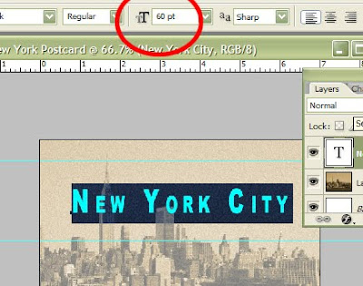
Step #8: Center and Enlarge Your Text to 60 pt. (See screen shot)
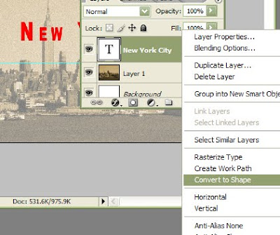
Step #9: Convert Type To Shape
Go into your type layer and right click in the blue area (not the layer name) and choose "Convert to Shape".
Step #10: Using your Direct Selection Tool (the white arrow)
Letter "A" on your keyboard will access this tool. Be sure to hold down the tool to locate the white arrow. It will be hidden under the Path Selection tool (black arrow).

Step #11: Typography (Re-designing Your Type)...see screen shot.
a. Drag a rectangle (with the white arrow) near the top edge of the letter "N".

b. Use your Up Nudge Arrow (from your keyboard) to send the top portion of the "N" to the upper guideline. Do the same for the lower portion of the letter and lower guideline.

c. Do the same for the letter "Y". For the letter "C" you'll need to make a box midway down so that when you "stretch the letter" to the guidelines, it will appear equally distributed.

d. Completed Typograghy: Notice in the screen how I fattened the letters.

Step #12: Clipping Mask
a. Download and Copy the following picture:

b. Paste the Picture: make sure the picture goes above the type/shape layer.

c. Make Clipping Mask--go to the Liberty layer (make sure it's above your type/shape layer and use the shortcut (Ctrl+Alt+G) to make the clipping mask. You can also right click the layer to find the "Create clipping mask" in the drop down menu or you can try the 3rd way(the most difficult) that's described in the screen-shot below.

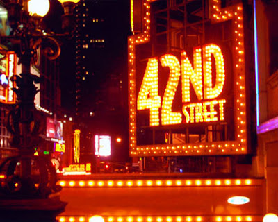
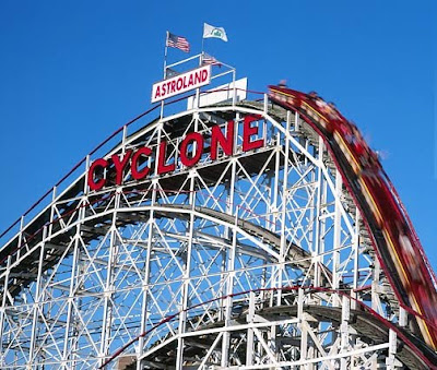
Choose the other two photos:
Step #13: Clipping and Masking
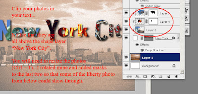
Step #14: Add the last two type layers...notice the layers palette.
